Finspo

Finspo is an Australian digital mortgage broker that aims to simplify and digitise the home-loan process.

My Role

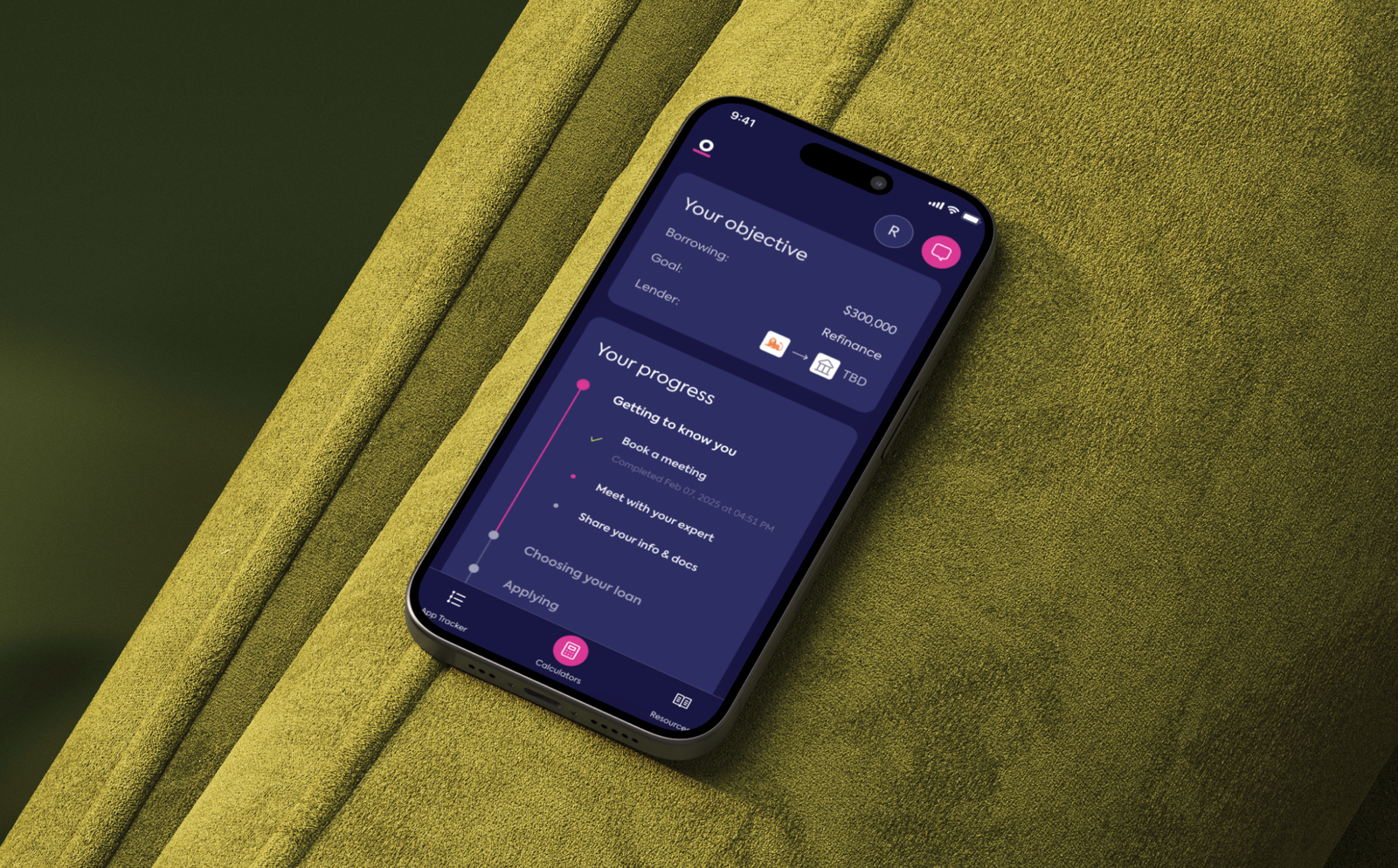
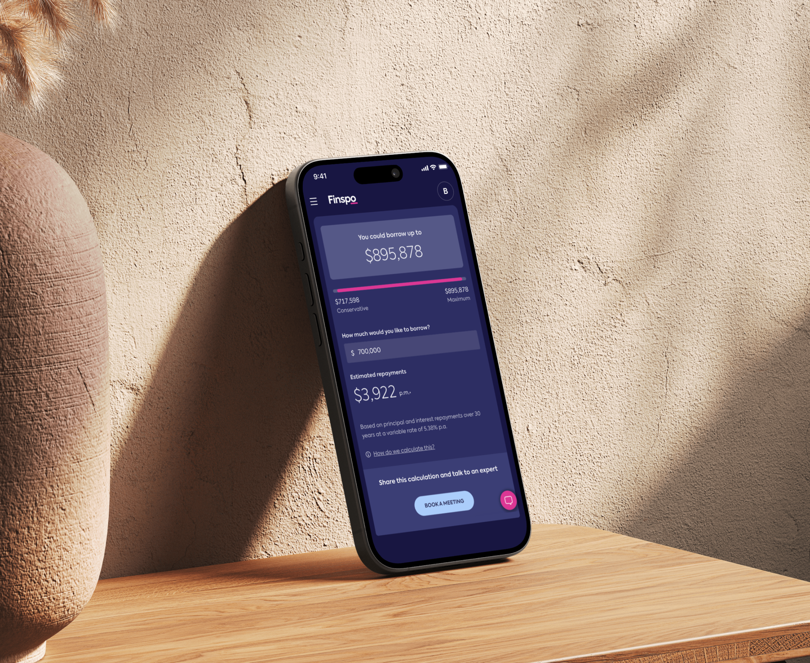
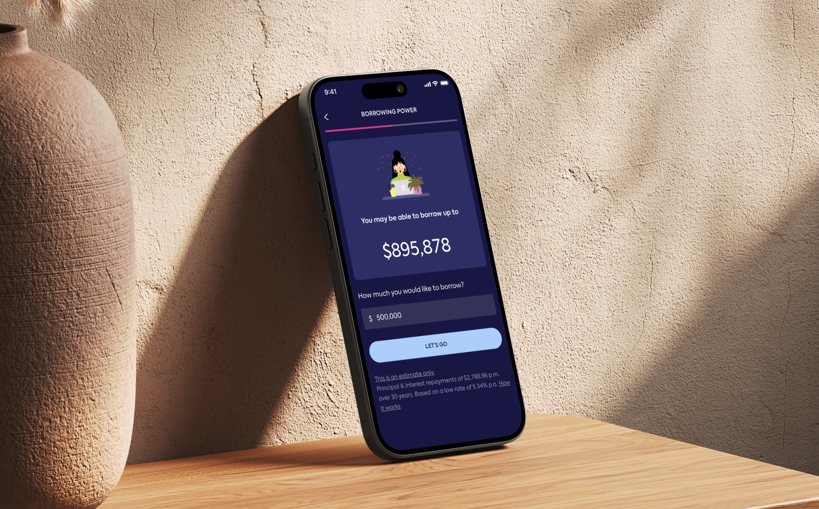
As the sole designer at Finspo, I lead end-to-end design across our website, customer portal, and internal staff tools. I own and maintain our design system to ensure visual and UX consistency across all touch points.

From early product ideation to ongoing refinement, I’ve had the opportunity to shape and scale our SaaS platform from the ground up.

Key Achievements

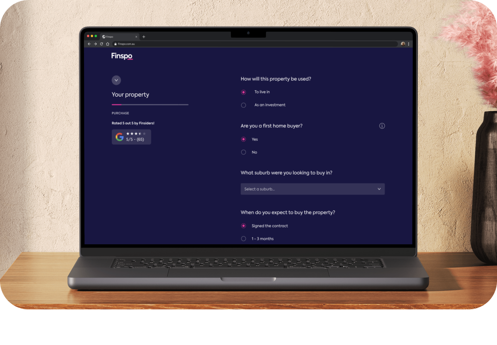
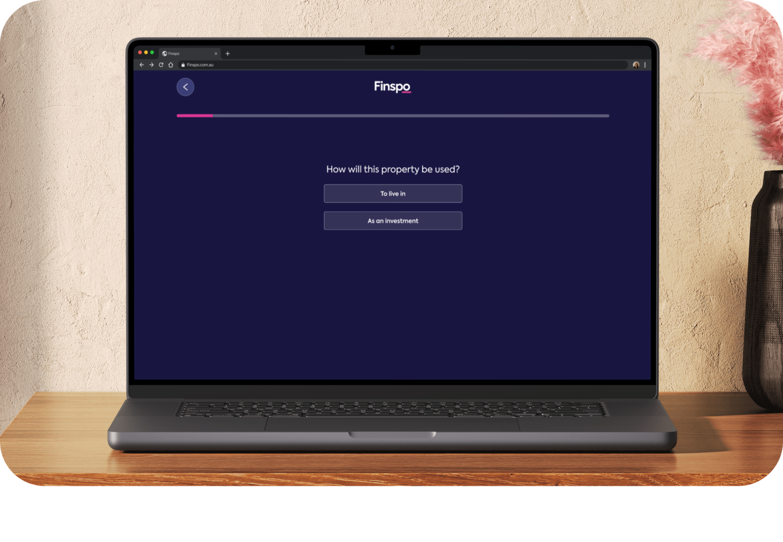
Increased booked meetings: By redesigning our onboarding form, switching from multiple questions per page to a single-question format improved completion rates.

Boosted pre-meeting document uploads: Approximately 20% of new clients upload their documents before their first meeting, enabling brokers to deliver recommendations earlier and saving time for both clients and staff.


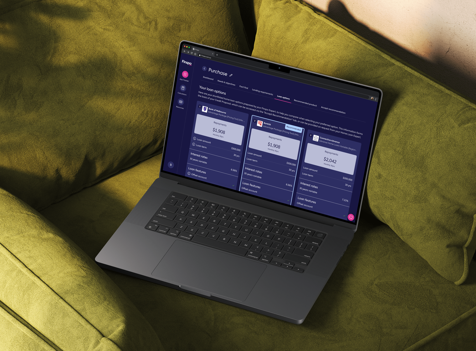
Improvement in Credit Proposal Acceptance Process at Finspo: A first in the industry, making the process faster, easier, and more client-friendly.

Increased Booked Meetings

Booked meetings are an important part of customer acquisition for Finspo. The call to action for every customer that comes to our website is to book a meeting to chat about either getting a home loan or refinancing an existing loan.


In order to increase conversion of our booking form we tried a few variations.

UX Research

Through competitor analysis, A/B testing and using Google analytics I discovered the following:


Too many questions lead to user drop-out (no surprise there).

Too few questions doesn’t instil trust and causes users not to book a meeting, or to book a meeting and not attend it.

Questions about expenses and property location are difficult for users to answer.

Design Outcomes

Switching from multiple questions per page to a single-question format improved completion rates. What’s the logic behind it?


Cognitive Load Is Reduced
When users see only one question at a time, it feels less overwhelming. Multi-question forms can create decision fatigue especially if users don’t know how long the form is or how much is left.


Mobile Usability Improves
On mobile devices, a single-question format fits much better on small screens. Scrolling and mis-clicking are reduced, which improves the completion experience.


Perceived Progress Increases
When paired with a progress bar, the user feels like they’re making steady progress. Micro-interactions or transitions between questions give a sense of momentum.


Higher Completion Rates
Our A/B tests have shown that single-question flows consistently increase conversion (form completion).

Other projects

Get in touch

I’d love to hear from you! Contact me today to discuss your project or ask any questions.